
The Branding Elements behind FIFA World Cup 2026.
From Logo down to Pattern.

FIFA World Cup 2026 is the biggest sporting event on the planet, it comes around every four years which makes it even more special so like everyone on the planet, we are excited for this one, to make this issue even more special, we would like to know where you are from, what country you are supporting this year and why?
Personally I'm supporting Brazil this year because my home country did not qualify but if I'm being honest it is because of my love for Neymar Jr, I feel he is someone who life hasn't really been kind to him when it comes to his career and I strongly believe it will make for a wonderful story if he wins it so I will be glued to the television the moment the tournament begins, so also would be millions of fans around the world.
The thing is that, they won't just be watching the football, they will be viewing the visual identity of the tournament, and when they go on social media… they will see the tournament logo, pattern, typography, colours and a lot more so as the design nerds we are, we've decided to break it down for it to make sense to you.
This isn't something new, just like the Olympics, FIFA always releases a new visual identity for the tournament every four years and for 2026, it comes with a brand identity as ambitious as the tournament itself. With the FIFA World Cup spanning three countries — the United States, Mexico, and Canada — for the first time in history, the creative challenge was enormous: how do you design one unified brand that feels at home in 16 cities, three nations, and three distinct cultures? The answer, it turns out, is to build a system rather than a symbol which they did.
The official logo was created by Public Address, a Toronto-based agency that also designed the logo for the 2023 FIFA Women's World Cup in Australia and New Zealand, and was one of the designers behind the LA28 Olympic logo.
While the emblem itself came from Public Address, FIFA's own in-house design team led and directed the broader campaign, working with several agencies and creatives across the identity system.
The Logo:
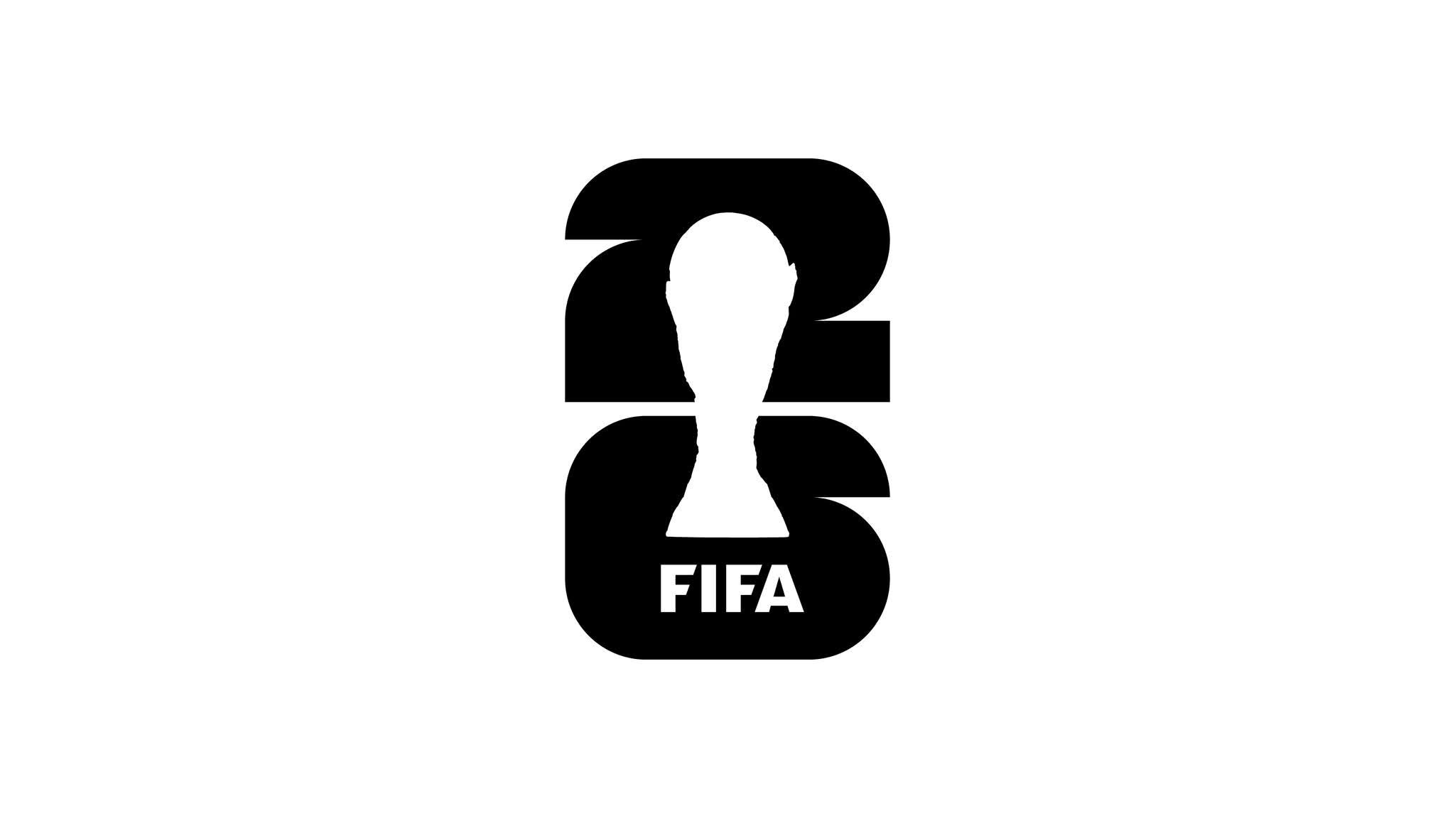
A Trophy Takes Centre Stage The centrepiece of the identity is a decision that sounds simple but is genuinely historic. The main emblem combines two elements: a realistic image of the FIFA World Cup Trophy in the foreground and the number "26" in large type — and this is the first time the actual trophy has ever appeared in an official World Cup logo, the trophy is usually replaced by an illustration of a icon in the trophy shape carrying the branding of the tournament but this time it was different.
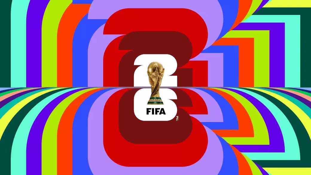
It is also the first time since 1990 that the words "World Cup" are absent from the logo entirely.
The first time also that the trophy is not illustrated or abstracted — it is rendered photographically, almost like a product shot, sitting boldly inside the numeral. But the "26" is not just a year marker. The number was designed with circular and rectangular forms that reflect the shape of a football and the squared edges of a pitch, and FIFA says it is made up of 48 squares and circles, referring directly to the 48 participating nations.
Every element carries deliberate meaning.
The colour palette
At its core is understated; black, white, and gold — a neutral base that allows for multiple adaptations across different contexts which we believe is incredibly brilliant.
The tournament is taking place in a single location so it would say well if it carries the colour of one nation while ignoring the other two.
What truly separates the 2026 branding from every World Cup before it is that it is not a single static logo — it is a design system built for scale and flexibility. The 2026 logo is best understood as a central emblem plus a wider brand system built for three countries and 16 host cities.

FIFA unveiled 16 Host City Logos which are based on the main emblem of the tournament, but unlike the core mark, the number 26 in each city logo is designed in bespoke colours. Each city's visual identity was built from its own cultural and geographic character. The creative team worked closely with the cities to develop a story and a colour palette drawn from emblematic places within each location.

The three host countries are each given their own colour tones within the system; Canada is represented through three shades of red, Mexico through three shades of green, and the United States through three shades of blue. The result is a brand that is cohesive at the global level but expressive and locally grounded at the city level — something no World Cup has attempted before at this scale.
Typography and Campaign Language
The official typeface, named "FWC 2026," was specifically created for the tournament and draws inspiration from the visual language of street football and the aesthetics of vintage posters, while a secondary font, Noto Sans, completes the system.


The campaign rallying cry — We Are 26 — was also built for three cultures simultaneously. The branding was created in multiple languages: #WeAre26, #OnEst26, and #Somos26, reflecting the distinct cultural identities of the three host countries.
FIFA has also launched a "YOUR CITY. YOUR COLORS." commercial campaign, linking the World Cup's image to neighbourhood pride and the identity of each host city, with city-specific merchandise including t-shirts, caps, and posters reinforcing a sense of local belonging. Three Mascots for Three Nations In a departure from every previous World Cup tournament — which featured a single mascot — FIFA created three distinct characters to represent the first-ever World Cup hosted by three nations.
The three official mascots are Clutch the Bald Eagle for the USA, Maple the Moose for Canada, and Zayu the Jaguar for Mexico… each thoughtfully developed to reflect the vibrant culture, heritage, and spirit of their respective nations.
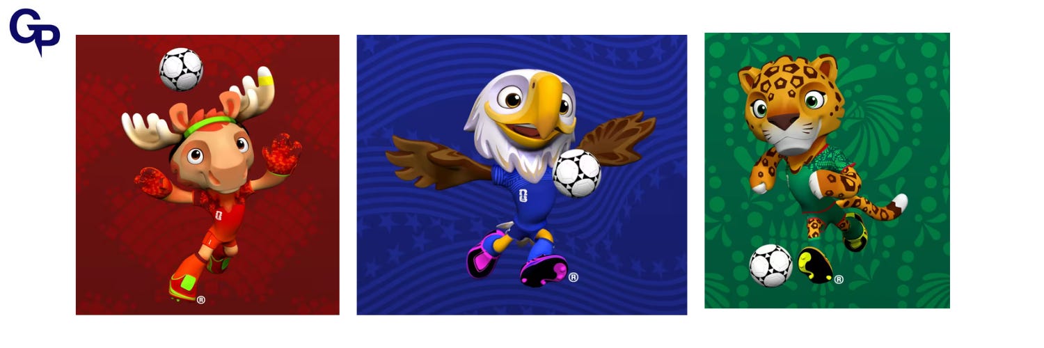
Even the mascots carry positional roles on a football pitch: Maple the Moose serves as goalkeeper, Zayu the Jaguar plays as striker — drawing from the animal's significance in ancient Mayan culture — and Clutch the Bald Eagle plays midfield, highlighting the togetherness the position represents. What Makes It Different at its heart, the 2026 FIFA World Cup brand represents a fundamental shift in how football's governing body thinks about identity design. Previous World Cups gave the world a single emblem tied to one host nation's culture. This edition flips that model entirely — the central mark is deliberately minimal and universal, while the richness, colour, and personality radiate outward through the host city system, the multilingual campaign language, and the trio of mascots.
FIFA has stated that this 2026 innovation could transform the emblem into an identifiable brand structure going forward, implying that future tournaments may adopt the same flexible system.
Basically what began as a creative response to the challenge of three co-hosts may well become the new standard for how the World Cup presents itself to the world. The brand has received mixed reactions — some finding the core logo too minimal, others praising its architectural clarity. But regardless of opinion, one thing is clear, unlike previous models centred on a single static emblem, the 2026 FIFA World Cup is testing a new paradigm in managing the visual identity of mega-events.
And with the tournament almost underway, the world is watching, not just the football, but the brand behind it.
Let's go Brazil, come on Neymar… let's win it this time.
Special credit to Public Address for coming up with an incredible logo and also huge credit to the in-house design team at FIFA.
If you are new here. We write articles weekly based on topics like these so if you enjoyed this one, you should subscribe.
If you want to work with us, visit our website [graphixpyramid.com]
Thank you for reading.