

Welcome to this week’s edition of Sketch Line Fridays, where we break down creative concepts that shape great design. Today, we’re diving into the Golden Ratio (1.618)—a timeless principle used in art, architecture, and typography. This mathematical harmony isn’t just for visual design; it plays a key role in text layout, making words more readable and aesthetically pleasing.
What is the Golden Ratio?
The Golden Ratio, often represented by the Greek letter φ (phi), is a special number approximately equal to 1.618. When applied to design, it helps create proportions that feel natural and visually appealing. This principle appears in nature, famous paintings, and even the structure of the human face. By using it in typography, you can improve the way people perceive and read your text.
How to Use the Golden Ratio in Text Design
1. Font Sizing for Balance
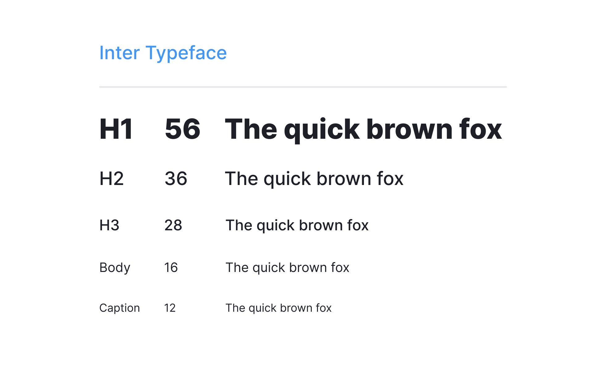
One of the easiest ways to use the Golden Ratio is by determining font sizes. The rule is simple: multiply or divide a base font size by 1.618 to get the ideal size for other text elements.
For example:
If your body text is 16px, multiply by 1.618 to get a subheading size of 26px.
Multiply 26px by 1.618 to get a main heading size of 42px.
If you need a smaller text size, divide 16px by 1.618, which gives 10px for captions or footnotes.
2. Line Height for Readability
Line height (the space between lines of text) affects readability. A common rule is to set line height between 1.5 to 1.618 times the font size.
If your body text is 16px, your line height should be around 24px (16 × 1.5) or 26px (16 × 1.618).
This extra spacing prevents text from feeling cramped and makes it easier to read.
3. Column Width for Comfortable Reading
The width of text columns should also follow the Golden Ratio for an optimal reading experience.
Research suggests that the ideal line length is 50–75 characters per line, including spaces.
If your text block is too wide, the reader's eyes will struggle to follow the lines.
If it’s too narrow, the text will feel cramped and hard to read.
4. Spacing and Margins
White space around text is crucial for readability and visual balance. Use the Golden Ratio to determine the spacing between paragraphs, sections, and margins.
If your paragraph spacing is 20px, the section spacing could be 32px (20 × 1.618).
If a text block has 40px of margin, a nearby image could have 64px (40 × 1.618) to maintain harmony.
5. Typography Pairing
When selecting fonts, pairing them using the Golden Ratio can enhance the overall design.
Choose a heading font size 1.618 times larger than the body text.
Use a combination of serif and sans-serif fonts, balancing contrast while maintaining readability.
Why Use the Golden Ratio in Text?
Improves readability – Proper sizing and spacing help readers process information easily.
Creates visual harmony – Balanced typography looks professional and appealing.
Enhances user experience – Well-structured text keeps readers engaged, especially on websites and digital content.
The Golden Ratio is a powerful yet simple tool for designing text layouts that are both readable and aesthetically pleasing. Whether you're working on a website, a printed document, or a blog post, applying these principles can make a significant difference. By adjusting font sizes, spacing, and layout elements with this ratio, you can create text that feels naturally beautiful and easy to read.
Start experimenting with the Golden Ratio in your designs today and see how small changes can lead to big improvements!
Don’t forget to check out our social media pages
Our Youtube for video contents
Main Instagram Page for all our design Projects &
Our Academy Page for your daily Design Tip.
Thank you for reading.
Hopefully We see you again next week.